The typefaces used by printed newspapers in Europe have undergone numerous changes over the years, linked to the advent of digital channels and the need to differentiate from other publications. The choice of a particular typeface by a newspaper always has a dual value: on one hand, it must facilitate reading and take up little space, while on the other hand, it must become a familiar and recognizable element for the reader.
This is why the most famous European newspapers have regularly commissioned new typefaces from internationally renowned graphic studios. The main objective is to retain readers and gain their trust. To quote Mario García, a news design expert and adjunct professor at Columbia Journalism School: “The role of typography and design is to remind you that you are in a place you trust. Which, in the age of fake news, is no small thing.
England: The Home of Times New Roman
Famous for commissioning, in 1931, one of the most famous typefaces in the world, Times New Roman, the Anglo-Saxon newspaper The Times has adopted several variants of this serif typeface in recent years, aiming to make it more modern and personal.
The latest version, released in 2006 by Brody Associates, is Times Modern, specially designed for smaller texts and featuring curves with 45-degree angles. The typeface was then taken up by the design studio Monotype, which added two weights, UltraLight and ExtraBold, along with a series of italics.
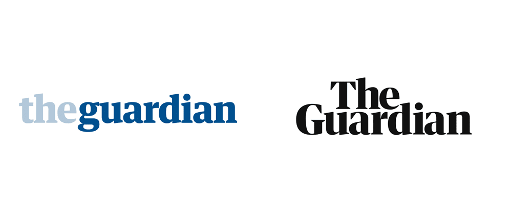
This year, the famous English masthead The Guardian announced the redesign of the typefaces used in its headlines, as part of a broader graphic overhaul that revamped the logo, website, and format of the newspaper, reverting to tabloid size.
The new typeface, called Guardian Headline, was born out of the need to reduce the footprint of headlines while maintaining a recognizable and unique style and ensuring better readability on digital platforms. The final result is solid and impactful lettering.
Italy: Between Modernity and Tradition
Even in Italy, some of the most famous newspapers have commissioned the creation of special typefaces for their own pages. This is the case with Sole24 Ore, which, in 2010, asked Luciano Perondi to work on a new, more readable typeface. The result is Sole Serif, inspired by Venetian calligraphic types from the 1500s and the world of publishing, but both modern and essential.
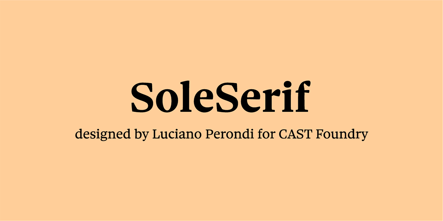
In 2018, the famous economic newspaper decided to complement Sole Serif with Sole Sans, a new linear-looking typeface designed to make graphics, diagrams, and smaller tables even more readable and suitable for both print and web channels.
This typeface also contains ancient references, from neoclassical English letterforms to early 19th-century English sans-serif, but compared to Sun Serif, it is more vertical and has more closed terminals. In 2011, Corriere della Sera renewed its graphic design with two new typefaces: Brera for the main page headline, characterized by clean lines and open geometry designed to limit text distortion, and Solferino for other headlines, a graceful typeface that adds a lot of elegance to the pages.
An aesthetic but also functional choice, which allowed the newspaper’s editorial team to improve readability through increased line spacing and a more contrasted rendering in print.
Spain: The Search for Cleanliness and Personality
In 2007, El País, the most widely read daily in Spain, commissioned the redesign of its characters from the famous Portuguese printer Mario Feliciano. The transition from black and white to color and technological innovations required lettering more suited to the new printing methods and the type of paper used, so the newspaper’s management was happy to replace the old Times with a modern typeface, without creating drastic breaks with the past. This is how Majerit was born, a serif typeface with a classic and neutral look, but contemporary style, designed to speed up reading.
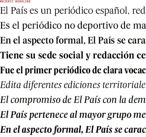
The Spanish newspaper El Mundo also completely rethought its graphic presentation in 2009, both for printed and digital versions as well as for the attached magazines. At the typographic level, a new, cleaner, and more readable typeface is adopted for the body text, Imperial, the typeface Majerit adopted in 2007 by El País. Copyright: https://www.felicianotypefoundry.com, and the body size and line spacing are increased by one point to another.
For the headlines, Valencia Extra Bold is chosen, also used on the cover, while Neo Sans S.T.D. is reserved for the sports section headlines, as it allows for a narrative in a “literary and almost subjective” tone of sporting events.
Our overview of the typefaces used by some of the most famous daily newspapers in Europe ends here, showing how the choice of typefaces is now a fundamental element for defining a strong visual identity, capable of distinguishing the newspaper from other mastheads and winning the trust of discerning readers.
Tag: what training is needed to become a printer?